|
[October 20th 2006]
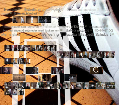
From the front page of http://tilbygningen.dk.
Stories about the meeting between art and people
An interview with Morten Schjoedt from Oncotype
The Danish group Oncotype has won prizes for interactive media art and advanced web design. Recently Oncotype became architects as well, although they didn't use bricks - but bits and bytes. Emil Bach Soerensen met the designer and film director Morten Schjoedt for a talk about the 'virtual extension' Oncotype has built for Thorvaldsens Museum in Copenhagen. Oncotype's artistic experiences with interactive films provide the fundament for an untraditional architecture. The result is chaotic design and open ended interaction, but the project also demonstrates a highly reflective way of using digital media to create a contemporary museum experience. Translated by Sofie Paisley.
Link to The Extension (Tilbygningen): http://tilbygningen.dk.
Congratulations on the new virtual extension (Tilbygningen) to Thorvaldsens Museum, which you are the architects behind. In collaboration with the museum, you have chosen an untraditional way of doing the extension. Please, tell us briefly about the background for the project.
For us it all started with winning an architectural competition, which Thorvaldsens Museum arranged in connection with the building of a new extension to their museum - a virtual extension.
Thorvaldsens Museum does not have the option of physically adding space to the museum, as the museum is a neo-classical icon, which cannot be altered. The museum therefore chose another solution and arranged an architectural competition, where the challenge was to add to the existing museum with digital means. In the project group we envisioned The Extension as a virtual space of possibilities. Instead of creating a three-dimensional imitation of the museum we opted to focus on more open boundaries of how you can understand a museum today.
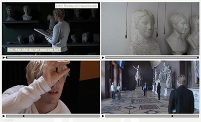
From The Corridors of http://tilbygningen.dk.
So you set out from the actual concept of virtuality. Not as something opposed to the physical, as the word is often understood and widely used, but as a space of potentials and possibilities?
Yes, that's a fundamental premise we have worked from, and which of course also has an impact on The Extension's final appearance. The central question in this respect is which possibilities such a building contains. Two related dimensions, which we thought it was obvious to work with, were the potentials in the meeting with art and the interpretation of art. Here we looked at European museum history, which through the ages has been influenced by different perceptions of art and artifacts. The different periods' perceptions of art and culture have also been reflected in the changing types of presentation.
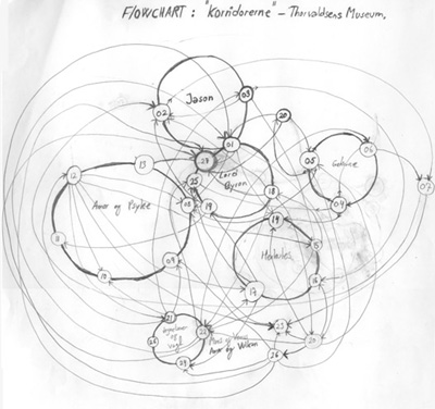
A 'flow chart' showing the structure of The Corridors of http://tilbygningen.dk.
The Kunstkammer of the Renaissance kings were among other things, a sort of precursor to the modern European museums we know today. In the Kunstkammer different types of objects were mixed and exhibited together. A part of our inspiration came from these more or less chaotic collections, gathered together by a curious gaze -a gaze preoccupied with the colourful variety of the world. With the Enlightenment's ideals of general cultivation the development went towards the public museums, which played a central role in the creation of national identity at the end of the 1800s. In connection to this the different objects exhibited side by side in the Kunstkammer, were divided into different categories and museums similar to modern scientific branches such as natural sciences, social sciences, art and culture. But the modern museum was to a large extent also creating the story of a European history of development, often seen in the light of the so-called primitive cultures. In many museums you still experience such a linear perspective and grand narration in the exhibitions, and we wanted to break with this logic. By and large, this is about an attitude towards museology where you don't try to tell history with a capital H, and where everything is put into a schematic sequence because, in such a history of development, where all phenomena are made to fit an 'universal axis', something is always suppressed. We wanted to reawaken the curious gaze and the fascination with the variety of the exhibited objects, thriving in the Kunstkammer. Our ambition was to create a space where individual stories are mixed with personal interpretation and the interest in background knowledge.
With The Extension we raise the question: Is there a form or a system, which in its structure is more open, and less excluding than the history of development? We think there are possibilities in the interactive media for both presenting a large amount of data coordinated and potentially chaotic in an open form and still make it possible for the users to find their way and stay in control through the interaction.
If we keep the connection between gaze and exhibition space, The Extension we have built, in collaboration with Thorvaldsens Museum, is an expression of a labyrinthine and chaotic gaze. There are many roads - and side-roads - making it a bit difficult to find your way around the site. In The Extension the chaotic expression and the labyrinthine orientation have become a design strategy and a structuring principle for the users' experience of Thorvaldsen's art.
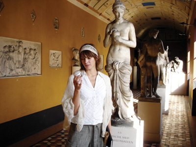
Laura Drasbæk in The Corridors of http://tilbygningen.dk.
I would like to return to the design strategies behind The Extension later, but maybe you can describe the project's different elements on a general level first?
The project has three layers, or interpretational levels, so with a point of departure in an architectural metaphor you can say there are three distinct types of spaces in The Extension. The spaces supplement each other and offer different ways to the meeting between the art and the contemporary museum visitor.
One of the spaces in The Extension is The Corridors. The Corridors consist of 27 small fictitious films, all staging a modern interpretation of Thorvaldsen's art through the eyes of different museum guests in the year 2006. Thorvaldsens Museum consists of many small rooms and stories, which we have taken as our point of departure. As an extension of this the films were envisioned as fragments or tableaus that guide the viewer around Thorvaldsen's universe - through the physical museum and also through the stories contained in his art. In this way the films reinterpret several of the myths and motifs, found in Thorvaldsen's art. The myth of Jason's conquest of the golden fleece, the 12 tribulations of Hercules and not least the love story between Cupid and Psyche play a central role in both Thorvaldsen's art and the filmic interpretations. Thorvaldsen is also known for his busts of his contemporaries e.g. the Romantic poet Lord Byron, who is a key character in several of the films. The films do not tell the full stories about Thorvaldsen's art and life but they comment on it and make it present with different means.
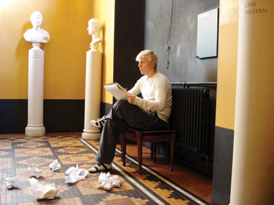
Thure Lindhardt in The Corridors of http://tilbygningen.dk.
Through the films we want the users to think about questions such as: what does it mean to visit a museum today? Which experiences and possibilities are there in museum visit? The films therefore include some everyday characters such as the museum guard, the sketching teacher and three young people, who all spend a beautiful afternoon at the museum. The more than 150 year old museum thus sets the stage for 'stories about the meeting between art and people', which is also the subtitle of the filmic space, The Corridors.
Another distinct type of space in The Extension is The Archive, which is a space where you can seek factual knowledge about Thorvaldsen's art, his contemporaries, Thorvaldsens Museum, ancient myths etc. The Archive was also created from a design strategy based on the aesthetic of chaos. When you click your way into The Archive you are overwhelmed by all the texts' titles at once like one continuous mass or pool of knowledge. The texts in The Archive are coordinated so it is up to the user to organise the material by means of functions such as 'sort' or 'find'. By moving the curser down the page, the hotspots are shown that you can click on to reach the wanted text page. With the chaotic design we want to give the user an experience of the massive amount of knowledge there is, and that it is therefore very important to be aware and choose your own way through the material.
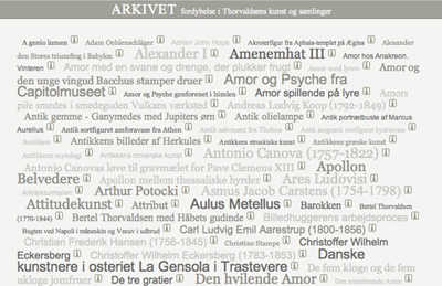
The Archive's interface. http://tilbygningen.dk.
The third distinct space in The Extension is The Project Room. The Project Room visualizes the students' own meeting with Thorvaldsen's art in a very concrete manner. On the front page you see different pictures, taken by students in connection with a visit to the museum's school services department (Skoletjenesten). So The Project Room functions as an online gallery or virtual exhibition room for the students who have worked with workshop projects at Thorvaldsens Museum. The Extension was first and foremost built for the school services department. The projects that are online now are the Portrait Workshop, where the students have portrayed themselves inspired by Thorvaldsen's sculptures, and a workshop about the tourist photo. In respect of the latter theme, the students have worked with the contemporary visual artist Soeren Lose, who has inspired the students to stage each other as tourists at Christiansborg Castle Square. In this way the students have created their own interpretations of the country they live in. There are interesting perspectives in the use of contemporary artists to facilitate the gaze of the students, so it will be interesting to see how the museum develops this dimension of the virtual space of interpretation.
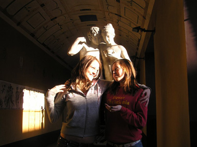
An example of a student project in The Project Room of http://tilbygningen.dk. With students Henriette Zeerlang and Anja Falkenberg. Photo: Cathrine Hassenkam.
The Extension's three distinct spaces, the fictional, the factual and the creative space, supplement each other as three different lenses in the meeting between the audience and Thorvaldsen's art. The spaces are also internally integrated with each other in the form of links, which for example enable the users to jump between different films, from film to Archive and on to The Project Room. The connection between the three spaces is most obviously gathered in The Project Room where the students can upload their own photo projects and work on the accompanying text and title. The Project Room is designed so that the students' presentations have the form of small individual sites. Here they can, via links, connect their own interpretations of Thorvaldsen's art, in text and pictures, to relevant knowledge in The Archive or to selected films in The Corridors. In this way the presentations become an expression of the students' own path through Thorvaldsen's universe and reflect a personal attitude towards the possibilities of different media in the meeting with the artistic material.
The Project Room was developed as an extension of the education program, The Digital Workshop, which Thorvaldsens Museum has had for some years. The Digital Workshop is based on an educational ambition of teaching the students, by means of relatively low-tech equipment, i.e. a digital camera and a simple photo editing program, that any picture is an interpretation. What has it meant for the development of The Extension that Thorvaldsens Museum already had experience with the use of digital technology?
It was an important principle for us to build on the foundation of experiences the museum already had. With the architectural competition they had thought about how the everyday educational experiences from the work in the school services department could be integrated and carried into the digital spaces. The fact that the museum was already so clear about the educational foundation made it easy for us to enter into an ongoing dialogue with them about the actual construction of The Extension. In the end it has resulted in a close and integrated connection between the physical and the digital spaces. The individual student presentations, exhibited in The Project Room, are for example an expression of an actual interaction between a creative work at the museum and the net as an exhibition space.
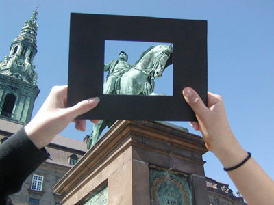
An example of a student project in The Project Room of http://tilbygningen.dk.
We have discussed that The Extension mediates three different levels of the meeting between art and people. The Extension makes concrete and thus visualizes some fundamental conditions, which are always made topical in connection with a visit to a museum. In The Extension, mental relations have become spaces and links etc.
Yes, to start off, I want to say that the digital media and especially interactivity is a revolution, which among other things break with the traditional attitudes to storytelling and communication.
Digital media have some characteristics that for example become apparent in a much more fluid and dynamic communication than we have experienced before, an overload of information, changeability, simultaneity and parallel sequences. All in all the new media can be characterized as a space of possibilities, where selection and de-selection challenges us all the time. Some of these characteristics are the same as we always experience mentally before a linear and controlled form has sorted out an otherwise fluid and chaotic content. Digital media can express this state of openness to the world, which is always there, before our sight is set on a specific expression or presentation.
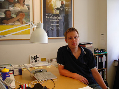
Morten Schjoedt in the office of Oncotype.
Which perspectives do you think this digital 'hypermediacy' contains? In connection to the new extension, but also to a large extent in the projects you have done as an artist group, it seems central to your aesthetic investigations to thematize the basic conditions of digital mediation. In the installation work Rekyl from 1998 and with the interactive feature film Switching from 2003 you incorporate the medium in a very direct way into the art experience.
A basic condition of digital communication, as we see it, is that the communication constantly shifts between appearing and disappearing, i.e. that the possibility of choices and user intervention creates this experience of being in the middle of the process between construction and deconstruction. This can of course also create some frustrating user experiences, but it is precisely in this situation that we hope to find a form of expression and a communication design, which is able to show an open gaze at the world before it is focused on a specific frame of knowledge.
With The Extension to Thorvaldsens Museum we have attempted to play with the form of the story in such a way, that the user experience elements in the mediation which both works with and against the storytelling. Our ambition is on one hand that the users are engaged in the stories that Thorvaldsen's art contains, but at the same time also keep a certain distance to the form of the storytelling, and thereby become aware of the fact that they are themselves a part of the act of telling a story and of finding knowledge.
Links:
The Extension (Tilbygningen): http://tilbygningen.dk
Thorvaldsens Museum: www.thorvaldsensmuseum.dk
Oncotype: www.oncotype.dk
|